01Product
rgba(28, 27, 24, .91)Frame cards, product views and try-on controls.
THEIA · Design system / 01
A portrait interface for choosing and trying on eyewear, shaped by the light of Constellation V2.
Explore light and materials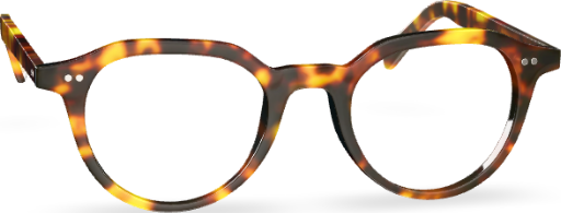
01 / Light study
Compare the same frame with and without the halo. Try Black to see how the light separates a dark frame from its background.
The halo peaks behind the bridge and fades toward the edges. Its three stops use 100%, 55% and 18% of the centre opacity, then reach zero at 73% of the ellipse. The grain backdrop helps inspect the silhouette. The live Constellation weave is in the Motion section.
02 / Colour and surfaces
See how the actual surface tokens read over a flat field or a brighter patch of grain.
rgba(28, 27, 24, .91)Frame cards, product views and try-on controls.
rgba(48, 48, 45, .96)Visit guidance and order summary. Look highlights use a separate gradient.
rgba(58, 58, 53, .98)Prescription values and verification status.
rgba(27, 27, 25, .98)Focused decisions such as consent or ending a visit.
Use colour swatches for the actual frame finishes. Keep the label and selection ring visible on every finish. Check text over the brightest part of the weave, where translucent surfaces have the least contrast.
03 / Typography and reach
Arial for the kiosk. Values are logical pixels. The wordmark uses the supplied artwork.
04 / Component states
05 / Constellation V2
Load the actual 32-inch preview to compare listening, thinking and speaking. Speaking is simulated in the review.
The logo turns into the weave over five seconds. Replay it on demand.
Listening, thinking and speaking share one weave. The live speaking state follows the audio signal.
The featured frame turns, then a reflection passes across the left temple. The card halo stays behind the frame.
Reduce movement, dim the weave or raise the visit controls in Settings.
06 / Reference screens
Each link opens the corresponding state in the screen review.